
| Join Telegram |  |
| Join Whatsapp Groups |  |
In this article, we have provided the list of Top 100 Power BI Interview Questions and Answers, which will help you to excel in your Power BI interview and secure your desired job.
★★ Latest Technical Interview Questions ★★
Top 100 Power BI Interview Questions and Answers
1. What is Power BI and what are its key features?
Power BI is a business analytics service provided by Microsoft that enables users to create interactive visualizations and business intelligence reports. Its key features include data modeling, data analysis, data visualization, and data collaboration. Power BI allows users to import and connect data from various sources, transform and shape the data, and create powerful visualizations and reports that can be easily shared with others.
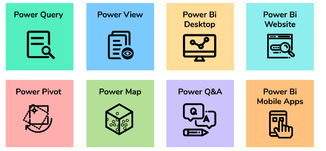
2. What are the major components of Power BI?
Power BI is an amalgamation of these major components:
- Power Query: Used for data mash-up and transformation, can extract data from various
- databases, and delete data from multiple sources.
- Power Pivot: A data modeling engine that uses DAX for calculations and creates
- relationships between tables to be viewed as pivot tables.
- Power View: Used for viewing data visualizations and provides an interactive display of
- various data sources for metadata extraction.
- Power BI Desktop: A development tool that combines Power Query, Power View, and
- Power Pivot to create advanced queries, models, and reports.
- Power BI Mobile: Provides an interactive display of dashboards from the Power BI site on
- Android, iOS, and Windows phones.
- Power Map: Used for 3D geospatial data visualization.
- Power Q&A: Used for natural language Q&A.
3. What are the different components of Power BI?
Power BI consists of several components, including Power BI Desktop, Power BI Service, Power BI Mobile, and Power BI Report Server. Power BI Desktop is a Windows application used to create reports and visualizations. Power BI Service is a cloud-based service that allows users to publish, share, and collaborate on reports. Power BI Mobile is a mobile app that enables users to view and interact with reports on their mobile devices. Power BI Report Server is an on-premises solution that allows users to host Power BI reports within their organization.
4. What is the difference between Power BI Desktop and Power BI Service?
Power BI Desktop is a Windows application used to create reports and visualizations, whereas Power BI Service is a cloud-based service used to publish, share, and collaborate on reports. Power BI Desktop is used to create and design reports, while Power BI Service is used to view, share, and collaborate on reports.
5. What are the benefits of using Power BI?
The benefits of using Power BI include the ability to easily connect to and analyze data from various sources, create powerful visualizations and reports, share insights with others, and collaborate on data analysis. Power BI also provides advanced analytics capabilities, including predictive analytics and machine learning, and enables users to stay informed with real-time data updates and alerts.
6. Where is the data stored in Power BI?
Power BI uses two primary repositories to store its data, which are Azure Blob Storage and Azure SQL Database. The data that is uploaded by users are typically stored in Azure Blob Storage, while Azure SQL Database is used to store all the metadata and artifacts related to the Power BI system itself.
7. How does Power BI connect to different data sources?
Power BI can connect to various data sources, including Excel spreadsheets, SQL Server databases, SharePoint lists, and cloud-based services such as Azure, Dynamics 365, and Salesforce. Power BI can also connect to web-based data sources, such as JSON and XML files, and supports various data connectivity options, including direct connectivity, import, and live connections.
8. What is DAX and how is it used in Power BI?
DAX (Data Analysis Expressions) is a formula language used in Power BI to create custom calculations and expressions. DAX formulas can be used to create measures, calculated columns, and calculated tables. DAX allows users to perform complex calculations and analysis on their data, including aggregation, filtering, and data modeling.
9. What is the difference between calculated columns and measures in Power BI?
Calculated columns are calculated at the row level and added to the data model as a new column. Calculated columns are computed when the data is loaded into Power BI and are used to create new values based on existing columns. Measures, on the other hand, are calculations that are computed at the aggregate level and are used to summarize data in a report. Measures are not stored in the data model and are computed on the fly when a report is created.
10. How can you optimize the performance of Power BI reports?
To optimize the performance of Power BI reports, users, can take several steps, including minimizing the amount of data imported, using DirectQuery mode instead of Import mode, optimizing data models, and using filters to limit the amount of data displayed in visualizations. Users can also use best practices for data modeling, such as avoiding circular dependencies and optimizing relationships between tables.
11. What is a dashboard?
In Power BI, a dashboard is essentially a canvas that allows users to create a story using templates and visualizations for a more comprehensive understanding of their data. It is a one-page report that contains the key highlights of the data, enabling users to quickly gain insights and make informed decisions based on the data presented.
12. What are the different visualization options available in Power BI?
Power BI provides a wide range of visualization options, including bar charts, column charts, line charts, pie charts, tables, matrices, maps, gauges, and cards. Power BI also supports custom visuals that can be created by third-party developers and imported into Power BI.
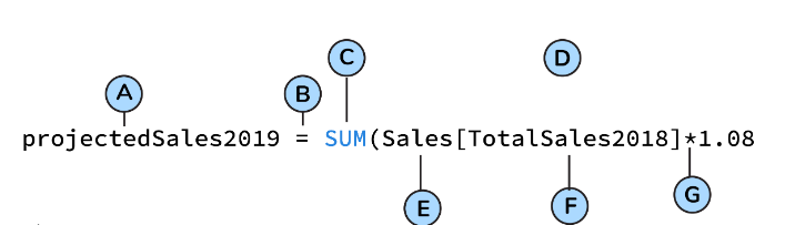
13. What is DAX?
Data Analysis Expression (DAX) is a formula library that is commonly used for calculations and data analysis purposes. The library includes a range of functions, operators, and constants that can be utilized to carry out calculations and generate results. By making use of DAX, users can unlock the full potential of their data sets, enabling them to create more insightful and informative reports.
DAX is a functional language that contains various elements, such as conditional statements, nested functions, and value references, among others. The formulas used in DAX can be either numeric, such as integers or decimals, or non-numeric, such as strings or binaries. Regardless of the data type, all DAX formulas always begin with an equal sign.
A: Name of the project
B: Start of the DAX formula
C: DAX function (to add)
D: Parentheses defining arguments
E: Name of the table
F: Name of the field
G: Operator
14. What is the difference between a calculated column and a measure in Power BI?
| Difference | Calculated Column | Measure |
|---|---|---|
| Definition | A column created by a user-defined expression | A calculation performed on a set of data |
| Aggregation | Cannot perform aggregation on calculated column | Measures can be used to perform aggregation |
| Used for | Used to create new columns based on expressions | Used to aggregate values and create KPIs |
| Syntax | ColumnName = <expression> | MeasureName = <expression> |
| Data Type | Same as the data type of the expression used | Resultant data type is determined automatically |
| Example | Calculating sales tax based on a fixed rate | Summing up sales or average of sales |
15. How can you customize the look and feel of Power BI reports?
Users can customize the look and feel of Power BI reports by using themes, changing colors, fonts, and styles, and adding custom visuals and images. Users can also format individual visualizations, such as changing the axis labels, adding tooltips, and setting the data category.
16. What are the different ways to share Power BI reports with others?
Power BI reports can be shared with others in several ways, including sharing a report through a web link, embedding a report in a website or application, publishing a report to the Power BI service, and exporting a report as a PDF or PowerPoint file. Power BI also supports collaboration features, such as commenting and sharing insights, that enable users to collaborate and share knowledge with others.
17. What are the critical components of the Power BI toolkit?
The most important components of PowerBI are:
- Power View
- Power Pivot
- Power Map
- Power Q&A
- Power Desktop
- Power Website
- PowerBI Mobile App
- Power Query
18. What is Power Query and how is it used in Power BI?
Power Query is a data transformation and shaping tool that allows you to connect to and clean up data from various sources. It is used in Power BI to retrieve, transform, and load data into the data model, which can then be used to create interactive reports and visualizations.
19. What are the different data transformation options available in Power Query?
Power Query offers several data transformation options, including filtering, sorting, grouping, aggregating, pivoting, splitting, and merging data. It also supports data type conversions, data formatting, and data cleaning operations such as removing duplicates and filling in missing values.
20. How can you combine data from multiple sources in Power Query?
In Power Query, you can use the “Combine Queries” feature to merge data from multiple sources. This feature allows you to join or append data from different tables or files based on common columns or keys. You can also use the “Merge Queries” option to combine data from two or more tables based on a common column.
21. Where do you reshape data in Power BI?
The data can be reshaped in Data Editing of PowerBI.
22. What is the difference between inner join and outer join in Power Query?
In Power Query, an inner join returns only the rows that have matching values in both tables. An outer join, on the other hand, returns all the rows from one table and the matching rows from the other table. There are three types of outer joins: left outer join, right outer join, and full outer join.
23. What is the syntax for creating a calculated column in Power BI?
The syntax for creating a calculated column in Power BI is:
ColumnName = <expression>
Where “ColumnName” is the name of the new column and “<expression>” is the calculation or formula used to derive the values in the column.
24. What is the difference between a slicer and a filter in Power BI?
| Difference | Slicer | Filter |
|---|---|---|
| Definition | A visual object used to filter data | A feature used to hide or display data |
| Used for | To filter a report or a dashboard | To hide or display specific rows or columns |
| Type of visuals | Only used in slicer visual | Can be used in slicer, table, chart, etc. |
| Functionality | Allows users to select one or more filter values | Filters data based on specific conditions |
| Presentation | Presented as a dropdown, list, or search box | Presented as a selection of criteria or values |
25. How can you merge queries in Power Query?
To merge queries in Power Query, you need to have a common column between the two tables. Then, you can select the two tables, go to the “Home” tab, and click on “Merge Queries”. You will then be prompted to select the common column and the type of join you want to perform.
26. What is the difference between Power BI and Excel?
Power BI is a business intelligence tool designed for creating interactive dashboards and reports, while Excel is a spreadsheet application used for data analysis and manipulation. Power BI is web-based and offers real-time data analysis, whereas Excel is desktop-based and focuses on data processing.
27. How can you refresh data in PowerBI?
The data can be refreshed in the Gateway in PowerBI by scheduling a refresh.
28. What are the different types of filters available in Power BI?
Power BI offers several types of filters, including visual-level filters, page-level filters, and report-level filters. Visual-level filters allow you to filter data within a single visual, while page-level filters apply to all visuals on a page. Report-level filters apply to the entire report.
29. What is the syntax for filtering data in a Power BI report?
The syntax for filtering data in a Power BI report is:
TableName[ColumnName] = <value>
Where “TableName” is the name of the table, “ColumnName” is the name of the column, and “<value>” is the value used for filtering.
30. What is drill through in Power BI and how is it used?
Drillthrough is a feature in Power BI that allows users to navigate from one report to another, providing more detailed information about a specific data point. For example, a user can click on a bar chart representing sales by region and drill through to a detailed report showing sales by product category for that region.
31. What is the maximum data limit per client for the free version of Power BI?
With a Power BI Free license a user can use 10 GB of storage in the cloud for hosting Power BI reports. The maximum size a Power BI report can be used in the cloud is 1GB.
32. What is the difference between Power BI Desktop and Power BI Service?
| Difference | Power BI Desktop | Power BI Service |
|---|---|---|
| Deployment | Desktop-based application | Web-based application |
| Connectivity | Can connect to various data sources on local computer | Can connect to cloud-based data sources |
| Collaboration | Limited collaboration features | Offers extensive collaboration features |
| Sharing | Can share reports through the web or other mediums | Can share reports through the cloud |
| Pricing | One-time purchase, free version available | Subscription-based with a free trial |
33. What are the different types of visuals available in Power BI and when to use them?
Power BI offers a wide range of visuals, including bar charts, line charts, scatter charts, pie charts, maps, tables, and matrices. The choice of visuals depends on the type of data being analyzed and the insights that need to be communicated. For example, a bar chart is useful for comparing values across categories, while a scatter chart is useful for exploring relationships between variables.
34. How do you use the syntax for creating a measure in Power BI?
The syntax for creating a measure in Power BI is:
MeasureName = <expression>
Where “MeasureName” is the name of the new measure and “<expression>” is the calculation or formula used to derive the measure.
Which is a single-page canvas that uses visualizations to depict a story.
PowerBI service dashboard is a single-page canvas that uses visualizations to depict a story.
35. What is the difference between a column chart and a bar chart in Power BI?
In a column chart, data is represented as vertical columns, while in a bar chart, data is represented as horizontal bars. Both charts are used to compare data categories, but column charts are typically used when there are fewer categories, and bar charts are used when there are more categories or longer category labels.
36. What is the difference between a table and a matrix visual in Power BI?
| Difference | Table Visual | Matrix Visual |
|---|---|---|
| Used for | Displaying data in tabular form | Displaying data in a pivot table format |
| Data display | Displays data in columns and rows | Displays data in rows and columns |
| Grouping | Cannot group data by rows or columns | Can group data by rows or columns |
| Aggregation | Can aggregate data using built-in functionality | Can aggregate data using built-in functionality |
37. How can you create a map in Power BI?
To create a map in Power BI, users can add a map visualization to their report, then add a location field to the map. Users can also customize the map by changing the map type, adding data layers, and adjusting the color scheme.
38. What is the syntax for using the CONCATENATE function in Power BI?
The syntax for using the CONCATENATE function in Power BI is:
CONCATENATE(text1, [text2], …)
Where "text1", "text2", etc. are the text strings to be concatenated.
39. What is the difference between a clustered column chart and a stacked column chart in Power BI?
In a clustered column chart, data is displayed as vertical columns grouped by category, while in a stacked column chart, data is displayed as stacked columns, with each column representing a category and the height of the column representing the value.
40. How can you use conditional formatting in Power BI?
Conditional formatting allows users to highlight specific data points based on a set of criteria. Users can apply conditional formatting to visualizations by selecting the formatting options from the Format pane, then selecting the data point and applying the formatting rules.
41. What is the difference between a bar chart and a column chart in Power BI?
| Difference | Bar Chart | Column Chart |
|---|---|---|
| Orientation | Horizontal orientation | Vertical orientation |
| Used for | Comparing data among categories | Comparing data among categories |
| Data Display | The length of the bars represents the data values | The height of the bars represents the data values |
| X-Axis Labels | Used for categories or discrete data | Used for categories or discrete data |
42. What are the different types of aggregations available in Power BI?
Power BI supports several types of aggregations, including sum, count, average, minimum, maximum, distinct count, and percentile.
43. What is the difference between a line chart and an area chart in Power BI?
In a line chart, data is displayed as a series of points connected by lines, while in an area chart, the area between the points and the axis is shaded. Both charts are used to show trends over time, but area charts can also be used to compare the contribution of each category to the total.
44. What is the syntax for using the DAX function to calculate the running total in Power BI?
The syntax for using the DAX function to calculate the running total in Power BI is:
Cumulative Total = CALCULATE(SUM(Table[Value]), FILTER(ALL(Table), Table[Date]
<= MAX(Table[Date])))
45. How can you use the drill down in Power BI?
Drilldown allows users to explore data at different levels of detail. Users can drill down on a visual by clicking on a data point or category, which will reveal more detailed data related to the selection.
46. How can you use drill-up in Power BI?
Drillup allows users to move back up the hierarchy and see data at a higher level of aggregation. Users can drill up on a visual by clicking on the drill-up button, which will reveal data at the next highest level.
47. What is the difference between a calculated column and a calculated table in Power BI?
| Difference | Calculated Column | Calculated Table |
|---|---|---|
| Definition | A column created by a user-defined expression | A table created using a user-defined expression |
| Use case | Used to create new columns based on expressions | Used to create new tables based on expressions |
| Input Data | Uses the existing data from a single table | Uses data from one or more tables |
| Output Data | Adds a new column to an existing table | Creates a new table with calculated data |
48. What is the difference between a gauge and a card in Power BI?
A gauge is a visual that displays a single value and compares it to a range of values, while a card displays a single value without any comparison.
49. How can you use the Q&A feature in Power BI?
The Q&A feature allows users to ask natural language questions about their data and receive visualizations in response. Users can access the Q&A feature by typing a question into the search bar at the top of the report canvas.
50. How do you use the syntax for creating a calculated table in Power BI?
The syntax for creating a calculated table in Power BI is:
TableName = FILTER(Table, <expression>)
Where “TableName” is the name of the new table and “<expression>” is the filter expression used to derive the table.
51. How can you use the Analytics pane in Power BI?
The Analytics pane allows users to add calculations and visualizations to their reports. Users can access the Analytics pane by selecting a visual and opening the Format pane, then selecting the Analytics tab.
52. What is the difference between a clustered column chart and a stacked column chart in Power BI?
| Difference | Clustered Column Chart | Stacked Column Chart |
|---|---|---|
| Data Display | Displays each category side-by-side | Displays each category stacked on top of each other |
| Comparison | Used to compare values within a category | Used to compare values between categories |
53. What is the difference between a matrix and a table in Power BI?
In a matrix, data is displayed in rows and columns, with the ability to group data by one or more columns. In a table, data is displayed in a single column or multiple columns with no grouping options.
54. How can you create a funnel chart in Power BI?
To create a funnel chart in Power BI, users can add a funnel visualization to their report, then add data fields to the visualization. Users can also customize the funnel chart by changing the color scheme and adjusting the layout options.
55. How can you create custom visuals in Power BI?
You can create custom visuals in Power BI by using the Power BI Custom Visuals SDK. The SDK includes a set of tools, libraries, and templates that allow developers to create custom visuals using HTML, CSS, and JavaScript.
56. What is the difference between a drill-down and a drill-through in Power BI?
| Difference | Drill-Down | Drill-Through |
|---|---|---|
| Definition | Allows users to view more detailed information | Allows users to view related information |
| Data Navigation | Navigates from a summarized view to a more detailed view | Navigates from one report to another or from one page to another within the same report |
| Example | Drill-down from a country level to a state level | Drill-through from a product to a product details page |
57. What is the syntax for using the SWITCH function in Power BI?
The syntax for using the SWITCH function in Power BI is:
SWITCH(expression, value1, result1, [value2, result2], …, [default])
Where "expression" is the value to be evaluated, "value1", "value2",
 etc. are the possible values of "expression", "result1", "result2",
etc. are the corresponding results, and "default"
is the default result if none of the values match.
58. What is the difference between a dashboard and a report in Power BI?
A dashboard is a single-page view of key performance indicators (KPIs) and metrics that provide a quick overview of a business’s performance. A report, on the other hand, is a more detailed view of the data, with multiple pages or tabs, that allows users to interact with the data, drill down, and explore different perspectives.
59. How can you use bookmarks in Power BI?
Bookmarks in Power BI allow you to save the current view of a report, including filters, slicers, and visuals, as a bookmark. You can then use this bookmark to return to that view at any time. Bookmarks can be used to create interactive reports with multiple views or to create a guided experience for users.
60. What is the difference between a slicer and a filter in Power BI?
A slicer and a filter in Power BI both allow users to filter data. The main difference is that a slicer is a visual element that provides a user-friendly way to filter data, while a filter is a more advanced filtering option that can be applied to one or more visuals or data fields.
61. What is the difference between Power BI and Excel for data analysis?
| Difference | Power BI | Excel |
|---|---|---|
| Purpose | Used for visualizing data and creating dashboards | Used for data analysis and spreadsheet tasks |
| Data Sources | Can connect to various data sources including cloud-based | Can connect to local or cloud-based data sources |
| Data Transformations | Offers extensive data transformation capabilities | Limited data transformation capabilities |
| Collaboration | Offers extensive collaboration features | Limited collaboration features |
| Visualization | Offers a wide range of visualization options | Offers limited visualization options |
62. How do you use the syntax for creating a slicer in Power BI?
Answer: The syntax for creating a slicer in Power BI is:
SlicerName = SELECT COLUMNS(Table, "ColumnName", ColumnName)
Where “SlicerName” is the name of the slicer, “Table” is the name of the table containing the data, and “ColumnName” is the name of the column to be used for the slicer.
63. How can you create a hierarchy in Power BI?
You can create a hierarchy in Power BI by selecting the relevant columns or fields and dragging them to the “Values” field well. You can then arrange the hierarchy by dragging and dropping the columns or fields in the “Fields” pane.
64. What is the difference between Power BI and PowerApps?
Power BI is a business intelligence tool used for data visualization and analysis, while PowerApps is a low-code platform used for building custom business applications. Power BI is designed for creating interactive reports and dashboards, while PowerApps is designed for creating custom forms and workflows.
65. What is the difference between Power BI and SSRS?
Power BI and SQL Server Reporting Services (SSRS) are both business intelligence tools, but they serve different purposes. Power BI is a cloud-based tool for creating interactive reports and dashboards, while SSRS is an on-premise tool used for creating paginated reports.
66. What is the difference between a single value visual and a card visual in Power BI?
| Feature | Single value visual | Card visual |
|---|---|---|
| Displayed value | Only one value | One or more values |
| Display format | Fixed display format | Customizable display format |
| Data grouping | Not applicable | Can be used to group related data |
| Interaction | Not interactive | Interactive |
| Customization | Limited | More customizable |
| Use case | Displaying KPIs or summary values | Displaying individual data points or summary values |
| Example | A gauge or a single number | A summary card or a scorecard with multiple values |
67. How can you create a calculated table in Power BI?
You can create a calculated table in Power BI by using the “New Table” option in the “Modeling” tab. You can then write a DAX expression that defines the calculation logic for the new table.
68. What is the syntax for using the AVERAGE function in Power BI?
The syntax for using the AVERAGE function in Power BI is:
AVERAGE(Table[Column])
Where “Table” is the name of the table and “Column” is the name of the column to be averaged.
69. How can you use parameters in Power BI?
You can use parameters in Power BI to allow users to dynamically control the behavior of visuals or calculations. Parameters can be used to filter data, change visual formatting, or adjust calculation logic.
70. What are the different ways to handle errors in Power Query?
Power Query offers several ways to handle errors, including removing or replacing error values, creating custom error messages, or ignoring errors altogether. You can also use the “Error Handling” options in the “Options” dialog box to configure how errors are handled.
71. How can you create a combo chart in Power BI?
You can create a combo chart in Power BI by selecting the relevant data fields and choosing “Combo Chart” from the “Visualizations” pane. You can then choose the chart types for each data series, such as line or column.
72. What is the difference between a slicer and a timeline in Power BI?
A slicer and a timeline in Power BI both allow users to filter data, but a slicer provides a static view of the filter, while a timeline provides a dynamic view of the filter over time.
73. How can you use the drillthrough filter in Power BI?
The drill-through filter in Power BI allows users to navigate from a summary report to a more detailed report by clicking on a data point. You can set up drill-through filters by creating a new report page and configuring the filter to display the relevant details.
74. What is the difference between a clustered bar chart and a stacked bar chart in Power BI?
In a clustered bar chart, each data series is displayed as a separate bar, while in a stacked bar chart, each data series is stacked on top of each other to form a single bar. Clustered bar charts are useful for comparing different categories, while stacked bar charts are useful for showing the composition of each category.
75. How do you use the syntax for creating a measure that calculates the percentage of the total in Power BI?
The syntax for creating a measure that calculates the percentage of the total in Power BI is:
Percent of Total = DIVIDE(SUM(Table[Column]), CALCULATE(SUM(Table[Column])
76. How can you create a donut chart in Power BI?
You can create a donut chart in Power BI by selecting the relevant data fields and choosing “Donut Chart” from the “Visualizations” pane. You can then customize the chart by adding labels, changing the color scheme, and adjusting the hole size.
77. How can you use the Quick Insights feature in Power BI?
The Quick Insights feature in Power BI allows users to automatically generate insights and recommendations based on their data. To use Quick Insights, simply select the relevant data fields and choose “Quick Insights” from the “Visualizations” pane.
78. What is the difference between a KPI and a gauge in Power BI?
A KPI (key performance indicator) in Power BI is a metric that measures a specific aspect of a business’s performance, while a gauge is a visual element that displays a single value on a scale, such as a speedometer or a thermometer. KPIs can be displayed in a variety of ways, including tables, cards, and charts.
79. What is the use of drill-through in Power BI?
Drill-through in Power BI allows users to navigate from a summary report to a more detailed report by clicking on a data point. Drill-through provides a way to explore data in more detail and gain deeper insights into a business’s performance.
80. How can you create a measure in Power BI?
You can create a measure in Power BI by using the “New Measure” option in the “Modeling” tab. You can then write a DAX expression that defines the calculation logic for the new measure.
81. What is a measure in Power BI?
A measure in Power BI is a calculated field that performs a mathematical or statistical calculation on the data. Measures can be used to perform complex calculations, such as averages, sums, and percentages, and can be used in visualizations and tables to display the results of the calculation.
82. What is the use of the slicer in Power BI?
A slicer is a visual filter that allows users to interactively filter the data displayed in a report or dashboard. It is a useful tool for exploring data and making it easier to understand.
83. How can you customize the theme of a Power BI report?
You can customize the theme of a Power BI report by selecting the “Switch Theme” option from the “View” tab and choosing from the available themes or by creating a custom theme using the “Edit Custom Theme” option.
84. Can you explain the difference between Power BI and Tableau?
Power BI and Tableau are both data visualization tools, but Power BI is a Microsoft product, while Tableau is developed by Tableau Software. Power BI is more tightly integrated with Microsoft technologies, such as Excel and Azure, while Tableau has a more extensive library of visualizations and is often preferred by data analysts and business intelligence professionals.
85. How can you schedule a data refresh in Power BI?
You can schedule a data refresh in Power BI by going to the “Settings” menu and selecting “Scheduled Refresh.” From there, you can specify the refresh frequency and credentials for the data source.
86. What is the use of the Power BI Report Server?
Power BI Report Server is an on-premises solution for publishing, managing, and delivering Power BI reports within an organization’s own network. It provides additional security and control over data compared to the cloud-based Power BI service.
87. How can you create a drill-through report in Power BI?
To create a drill-through report in Power BI, you need to define the relationships between the tables in your dataset and create a drill-through page with additional details or data. You can then add a drill-through action to a visual or field in your main report to link to the drill-through page.
88. Can you explain the difference between Power BI and Excel?
Power BI and Excel are both Microsoft products, but Power BI is primarily a data visualization and business intelligence tool, while Excel is a spreadsheet program with some data analysis and visualization capabilities. Power BI is designed to handle larger datasets and provides more advanced data modeling and visualization options.
89. What is the use of the Power BI Mobile app?
The Power BI Mobile app allows users to access their Power BI reports and dashboards on a mobile device, including iOS, Android, and Windows. It provides a seamless experience for viewing and interacting with data on the go.
90. How can you publish a Power BI report on the web?
To publish a Power BI report to the web, you can use the “Publish to Web” option in the “File” menu. This generates an embed code that can be inserted into a website or shared with others.
91. What is the use of Q&A in Power BI?
Q&A is a natural language query feature in Power BI that allows users to ask questions about their data and receive answers in the form of visualizations. It uses machine learning algorithms to understand the intent behind the user’s question and provides the most relevant results.
92. How can you create a custom theme in Power BI?
To create a custom theme in Power BI, you can use the “Switch Theme” option and then select the “Edit Custom Theme” option. From there, you can modify the colors, fonts, and other design elements to create a personalized theme for your report or dashboard.
93. How can you create a trend analysis report in Power BI?
To create a trend analysis report in Power BI, you can use visualizations such as line charts, area charts, or stacked charts to display changes over time. You can also use features such as forecasting and trend lines to predict future trends. To analyze trends across different categories, you can use slicers or filters to segment the data and compare trends within each segment.
94. Can you explain the difference between Power BI and SSRS?
Power BI is a business analytics service that enables users to visualize and analyze data through interactive reports and dashboards. It is designed to provide a self-service analytics platform that can be easily used by business users. In contrast, SQL Server Reporting Services (SSRS) is a traditional reporting tool that provides operational reports and paginated reports that are often used by developers or IT professionals. SSRS is more focused on creating formatted and printable reports, whereas Power BI is designed for creating interactive and visual reports.
95. What is the use of the Power BI Desktop Query Editor?
The Power BI Desktop Query Editor is used to transform and shape data from various sources. It allows users to perform data cleansing and transformation operations such as filtering, merging, and grouping data. The Query Editor provides a graphical interface that makes it easy to perform these operations without having to write complex SQL queries.
96. How can you create a report using a live connection in Power BI?
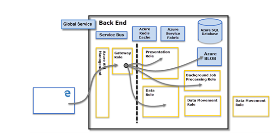
To create a report using a live connection in Power BI, you need to establish a connection to a data source that supports live connections. Once the connection is established, you can create a report by selecting the data fields that you want to display in your report. You can use visualizations such as charts, tables, and maps to display your data. With a live connection, any changes made to the underlying data are immediately reflected in your report.
97. Can you explain the use of the Power BI architecture?
The Power BI architecture is designed to provide a scalable and secure platform for sharing and collaborating on business intelligence data. It consists of several components, including the Power BI service, Power BI Desktop, Power BI mobile apps, and the Power BI Gateway. The Power BI service is the cloud-based platform that hosts the reports and dashboards, while Power BI Desktop is the authoring tool used to create the reports. The Power BI mobile apps enable users to access and interact with reports on mobile devices, while the Power BI Gateway is used to connect on-premises data sources to the Power BI service.
98. What is the use of the Power BI Gateway Cluster?
The Power BI Gateway Cluster is used to provide high availability and redundancy for on-premises data sources that are connected to the Power BI service. It is a group of multiple gateway installations that are configured to work together. If one gateway installation fails, another installation in the cluster can take over the workload, ensuring that the data sources remain accessible.
99. How can you create a clustered column chart in Power BI?
To create a clustered column chart in Power BI, you need to select the data fields that you want to display in the chart. You can then select the clustered column chart visualization and drag the data fields onto the appropriate axis. You can also customize the chart by adjusting the colors, font sizes, and other properties.
100. Can you explain the use of the Power BI workspace?
The Power BI workspace is a collaboration area where users can create and share reports, dashboards, and other content. It provides a centralized location for organizing and managing content and allows multiple users to work together on the same project. Workspaces can be customized with roles and permissions to control who has access to the content and what they can do with it.
This set of Top 100 Power BI Interview Questions and Answers can be a valuable resource for job seekers preparing for Power BI Technical Interview Questions in the field. By following reliable sources such as freshersnow.com, individuals can stay informed about the latest developments in Power BI and enhance their knowledge to excel in the Power BI Interview Questions and Answers process.