
| Join Telegram |  |
| Join Whatsapp Groups |  |
Top Tableau Interview Questions and Answers: Tableau is a popular business intelligence software that enables users to visually represent data from various sources and create interactive and shareable dashboards. It simplifies the process of analyzing data and evaluating the product-market fit, thanks to its many built-in features for data exploration. With Tableau, users can explore and manipulate data without feeling overwhelmed by the software’s complexity. In this context, having a clear understanding of the Top 100 Tableau Interview Questions and Answers can be the key to landing your dream job.
Tableau Technical Interview Questions
To make a good impression during Tableau job interviews, it is important for candidates to have a solid understanding of the Tableau Interview Questions for Freshers. This will demonstrate their proficiency in the Latest Tableau Interview Questions and increase their chances of impressing potential employers.
Top 100 Tableau Interview Questions and Answers
1. What is Tableau?
Tableau is a business intelligence and data visualization software that allows users to connect, visualize, and share data in a visually appealing way. It offers a range of tools for data blending, analysis, and dashboard creation.
2. What are the different types of joins in Tableau?
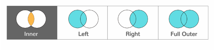
- Left Outer Join: Extracts all the records from the left table and the matching rows from the right table.
- Right Outer Join: Extracts all the records from the right table and the matching rows from the left table.
- Full Outer Join: Extracts the records from both the left and right tables. All unmatched rows go with the NULL value.
- Inner Join: Extracts the records from both tables.
3. What is the difference between Tableau and other business intelligence tools?
Tableau offers a more user-friendly and intuitive interface compared to other BI tools. It allows users to create interactive dashboards with drag-and-drop functionality, making it easier to create and share visualizations. Additionally, Tableau supports a wide range of data sources and has advanced data blending and analytics capabilities.
4. What are the different types of charts available in Tableau?
Tableau offers a wide range of charts and graphs, including bar charts, line charts, area charts, scatter plots, heat maps, tree maps, and more.
5. What is the difference between a dimension and a measure in Tableau?
In Tableau, dimensions are categorical data that can be used to segment, filter, and group data. Examples of dimensions include region, product, or date. Measures, on the other hand, are quantitative data that can be aggregated, such as sales, profit, or quantity.
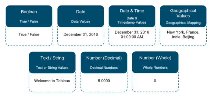
6. What are the different datatypes in Tableau?
Tableau supports the following data types:
7. What is a dual-axis chart in Tableau?
A dual-axis chart is a type of chart in Tableau that allows users to compare two measures on the same chart by displaying them on two separate axes. This type of chart is often used to compare two measures with different scales or units of measure.
8. How do you create a calculated field in Tableau?
To create a calculated field in Tableau, go to the Analysis menu and select Create Calculated Field. Then, enter the formula for the calculated field using Tableau’s formula syntax.
9. What are the different types of filters in Tableau?
Tableau offers several types of filters, including dimension filters, measure filters, context filters, and table calculations.
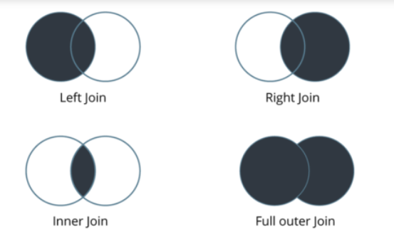
10. What are the different types of joins in Tableau?
The joins in Tableau are same as SQL joins. Take a look at the diagram below to understand it.
11. What is the Tableau data engine?
The Tableau data engine is a high-performance, in-memory database technology that allows users to rapidly analyze and query large data sets. It is optimized for Tableau’s data visualization and analytics workflows.
12. How can you create a dual-axis chart in Tableau?
- To create a dual-axis chart in Tableau:
- Create a chart using the first measure
- Drag the second measure onto the same chart
- Right-click on the second measure and select “Dual Axis”
- Adjust the formatting and labels as desired
13. Can you explain the concept of blending in Tableau?
- A way to combine data from multiple sources or tables that cannot be joined directly
- Uses a common field or key to match data from each source
14. What are the differences between the extract and live connection in Tableau?
- Extract: A snapshot of the data that is stored locally in Tableau
- Live: A connection to the original data source that accesses data in real-time
- Extracts can be faster and more efficient for large data sets, while live connections provide more up-to-date data
15. Can you explain the process of creating a hierarchy in Tableau?
- Drag a field onto the “Rows” or “Columns” shelf
- Right-click on the field and select “Create Hierarchy”
- Drag additional fields onto the hierarchy as desired
16. How can you use a parameter in a Tableau report?
- Create a parameter by selecting “Create Parameter” from the “Analysis” menu
- Drag the parameter onto a worksheet or dashboard
- Use the parameter in calculations or to control the values displayed in the visualization
17. What is the difference between a discrete and continuous field in Tableau?
- Discrete: A field with a finite number of distinct values, such as categories or dates
- Continuous: A field with a range of values, such as measurements or time intervals
The type of field affects the type of visualizations and analyses that can be performed
18. Can you explain the difference between a join and a blend in Tableau?
- Join: Combines data from multiple tables based on a common field or key
- Blend: Combines data from multiple data sources that cannot be joined directly, using a common field or key
19. How can you create a calculated field in Tableau?
- Select “Create Calculated Field” from the “Analysis” menu
- Enter a formula that uses the available fields and functions
- Adjust the formatting and labels as desired
20. What are the various types of charts that can be created in Tableau?
- Bar charts
- Line charts
- Scatter plots
- Pie charts
- Heat maps
- Treemaps
- Gantt charts
- Bullet graphs
- Box plots
- Waterfall charts
- Funnel charts
- and many more!
21. What is a TDE file in Tableau?
A TDE (Tableau Data Extract) file is a compressed and optimized extract of data from a data source that can be used by Tableau for faster data analysis and visualization.
22. What is a parameter in Tableau?
A parameter in Tableau is a user-defined value that can be used in calculations, filters, and other parts of a Tableau workbook. Parameters can be used to control various aspects of a visualization, such as filtering, sorting, or chart type.
23. What is the difference between blending and joining data in Tableau?
Joining data in Tableau combines tables with a common field while blending data allows you to combine data from different data sources without merging the data sources.
24. How do you perform data blending in Tableau?
To perform data blending in Tableau, you need to have at least two data sources. Then, you can create a blended view by dragging and dropping fields from each data source onto the canvas, and Tableau will automatically blend the data based on the common fields.
25. What are the different types of joins in Tableau?
Tableau supports several types of joins, including inner join, left join, right join, and full outer join. These joins allow you to combine data from different tables based on common fields.
26. What is the difference between a live connection and an extract in Tableau?
A live connection in Tableau connects directly to the data source, while an extract creates a subset of the data that is stored in memory for faster processing.
27. What is the Tableau workbook file format?
The Tableau workbook file format is .twb. It contains a set of worksheets, dashboards, and stories, as well as data connections and visualizations.
28. What is the Tableau packaged workbook file format?
The Tableau packaged workbook file format is .twbx. It is a compressed file format that includes the workbook (.twb) and any external data sources used in the workbook.
29. What is the Tableau data source file format?
The Tableau data source file format is .tds. It contains the information needed to connect to a data source, such as the server address, username, and password.
30. What is the difference between a discrete and continuous field in Tableau?
A discrete field in Tableau contains a finite number of distinct values, such as categories or groups. A continuous field contains an infinite number of values, such as numbers or dates.
31. What is aggregation in Tableau?
Aggregation in Tableau is the process of combining multiple values into a single value, such as summing sales by region or averaging profits by product.
32. What is disaggregation in Tableau?
Disaggregation in Tableau is the opposite of aggregation. It involves displaying inidual data points instead of aggregated values, allowing you to see the details behind the summary statistics.
33. What is a set in Tableau?
A set in Tableau is a custom field that is created by selecting specific values from a field or a range of values, and then grouping them together based on a specific condition. Sets can be used to create dynamic groups of data that can be easily analyzed and visualized.
34. What is a group in Tableau?
A group in Tableau is a custom field that is created by grouping together similar values from a dimension. Groups can be used to create higher-level categories from a detailed set of data, making it easier to analyze and understand.
35. What are the different types of shelves in Tableau?
There are four main types of shelves in Tableau: Rows, Columns, Pages, and Marks. Rows and Columns are used to create the main structure of the view, Pages are used to create multiple pages within a workbook, and Marks are used to define the visual representation of the data.
36. What is the difference between a sheet and a dashboard in Tableau?
A sheet in Tableau is a single view that displays a particular set of data, while a dashboard is a collection of sheets and other dashboard components, such as filters, that are organized into a single interface to create a comprehensive view of the data.
37. What is the difference between a worksheet and a chart in Tableau?
A worksheet in Tableau is a single view that can contain one or more charts or other visualizations, while a chart is a specific type of visualization, such as a bar chart, line chart, or scatter plot, that is used to represent a particular set of data.
38. How can Tableau be used to analyze sales performance by region or product?
| Techniques | Description |
|---|---|
| Geographic Mapping | Plotting sales data on a map to visualize regional patterns |
| Product Hierarchies | Grouping products into categories or subcategories to analyze sales performance at different levels |
| Filters | Filtering sales data by specific regions, time periods, or other variables to focus on relevant information |
| Comparisons | Comparing sales data between different regions or products to identify trends and patterns |
| Forecasting | Using historical sales data |
39. How do you use hierarchies in Tableau?
Hierarchies in Tableau are created by grouping related dimensions together into a hierarchical structure. This can be done by dragging and dropping the dimensions onto the hierarchy shelf, or by right-clicking on a dimension and selecting the “Add to Hierarchy” option.
40. What are the different types of maps available in Tableau?
Tableau supports several different types of maps, including choropleth maps, point maps, filled maps, and symbol maps. Each of these map types can be used to visualize geographic data in different ways.
41. What is the Tableau Server and how does it work?
The Tableau Server is a web-based platform that allows users to share and collaborate on Tableau content. It works by hosting Tableau workbooks and visualizations on a centralized server, which can be accessed by authorized users through a web browser or mobile device.
42. What is the Tableau Desktop and how does it work?
The Tableau Desktop is a desktop-based application that allows users to create, edit, and publish Tableau workbooks and visualizations. It works by providing a drag-and-drop interface that allows users to easily connect to and visualize data from a variety of sources.
43. What are the different Tableau products?
Tableau offers several different products, including Tableau Desktop, Tableau Server, Tableau Prep, Tableau Online, and Tableau Mobile. Each of these products is designed to support different aspects of the data analysis and visualization process.
44. How do you create a calculated field using a table calculation in Tableau?
To create a calculated field using a table calculation in Tableau, you can use the “Quick Table Calculation” option or the “Table Calculation” dialog box. This allows you to specify the calculation type, the scope of the calculation, and any additional parameters or filters.
45. What is the difference between a parameter and a filter in Tableau?
A parameter in Tableau is a user-defined input that can be used to modify certain aspects of the visualization, such as the range of values displayed or the color palette used.
46. How do you use a trend line in Tableau?
To use a trend line in Tableau, you can simply drag a field onto the Rows or Columns shelf, and then click on the drop-down menu next to the field and select “Add Trend Line.” You can then choose the type of trend line you want to add, such as linear, polynomial, or exponential.
47. How do you create a calculated field using a LOD (Level of Detail) expression in Tableau?
To create a calculated field using a LOD expression in Tableau, you can use the curly braces syntax to specify the level of detail you want to use, followed by the aggregation function and the field you want to aggregate. For example, {FIXED [Category]: SUM([Sales])} calculates the sum of sales for each category, regardless of any filters or dimensions in the view.
48. What are the different types of charts and graphs that can be created in Tableau?
| Chart Types | Description |
|---|---|
| Bar Charts | Comparing data across categories using bars of varying lengths |
| Line Charts | Showing trends or changes in data over time using connected data points |
| Scatter Plots | Visualizing the relationship between two numerical variables using dots |
| Heat Maps | Displaying data as colored squares or rectangles to highlight patterns |
| Geographic Maps | Displaying data on a map to show location-based patterns |
49. What are the different types of LOD expressions in Tableau?
Tableau supports three types of LOD expressions: FIXED, INCLUDE, and EXCLUDE. FIXED expressions allow you to specify a fixed level of detail, while INCLUDE and EXCLUDE expressions allow you to add or remove dimensions from the view.
50. What is the difference between a LOD expression and a table calculation in Tableau?
A LOD expression in Tableau is used to aggregate data at a specific level of detail, while a table calculation is used to perform calculations on aggregated data within a table or chart.
51. How can Tableau be used to analyze social media data and sentiment analysis?
| Techniques | Description |
|---|---|
| Web Data Connectors | Connecting directly to social media APIs to import data into Tableau |
| Text Analytics | Using built-in or third-party text analytics tools to analyze the sentiment and topics of social media posts |
| Network Analysis | Visualizing social networks to identify influencers and connections between users |
| Geospatial Analysis | Analyzing social media data by location to identify trends and patterns |
| Time Series Analysis | Analyzing changes in social media data over time, such as changes in sentiment or topic popularity |
52. What is the difference between a dimension filter and a measure filter in Tableau?
A dimension filter in Tableau filters data based on categorical fields, such as product or region, while a measure filter filters data based on numeric fields, such as sales or profit.
53. What are the different ways to format data in Tableau?
Tableau provides various options to format data, including changing the data type, formatting numbers and dates, applying conditional formatting, and using special characters and symbols.
54. What is the difference between a discrete and a continuous axis in Tableau?
A discrete axis in Tableau displays discrete values, such as categories or dates, as separate and distinct items on the axis. A continuous axis displays values as a continuous range, such as a time series or a range of numbers.
55. What is a reference line in Tableau?
A reference line in Tableau is a straight line that is added to a chart to indicate a specific value or threshold, such as an average or a target.
56. What is a reference band in Tableau?
A reference band in Tableau is a shaded area that is added to a chart to indicate a range of values or thresholds, such as a confidence interval or a standard deviation.
57. How do you create a dashboard in Tableau?
To create a dashboard in Tableau, you can drag and drop worksheets and views onto a blank canvas, and then arrange and format them as desired. You can also add text, images, and web pages to the dashboard, and use filters and parameters to allow for interactivity and customization.
58. What are the best practices for creating a dashboard in Tableau?
- Keep it simple and focused on the key insights
- Use consistent formatting and layout
- Use appropriate visualization types for the data
- Use color sparingly and with intention
- Test and optimize for performance
59. How can Tableau be used to analyze customer behavior and preferences?
| Use Cases | Description |
|---|---|
| Cohort Analysis | Analyzing user groups that share a common characteristic, such as the date they first made a purchase, and tracking their behavior over time |
| Customer Segmentation | Grouping customers based on common characteristics, such as demographics or purchase history, to identify patterns and trends |
| Customer Lifetime Value Analysis | Analyzing the total amount of revenue a customer is likely to generate over their lifetime with a business |
| Churn Analysis | Analyzing the reasons why customers stop doing business with a company and identifying potential strategies to prevent churn |
| Customer Satisfaction Analysis | Analyzing the feedback from customer surveys or social media to gauge overall satisfaction and identify areas for improvement |
60. How do you use the LOD (Level of Detail) expression syntax in Tableau?
The LOD expression in Tableau is used to define a level of detail for a calculation. The syntax for the LOD expression is:
{FIXED [Dimension 1], [Dimension 2], ... : [Aggregation]}, for example: {FIXED [Region], [Category] : SUM([Sales])}.
61. How do you create a story in Tableau?
To create a story in Tableau, you can select the “New Story” option from the “Dashboard” menu, and then add inidual sheets and dashboards to the story. You can also add text, images, and other content to provide context and narrative to the story.
62. What are the best practices for creating a story in Tableau?
- Use a clear and concise narrative structure
- Highlight the most important insights and findings
- Use supporting data and visualizations to reinforce key points
- Use formatting and layout to guide the reader through the story
- Test and optimize for performance
63. How do you embed a Tableau visualization on a website?
To embed a Tableau visualization on a website, you can use the “Share” feature in Tableau to generate an embed code, which can be added to a webpage using an HTML or JavaScript tag.
64. How can Tableau be used to create interactive dashboards and reports?
| Techniques | Description |
|---|---|
| Drag-and-Drop Interface | Adding and arranging visualizations on a canvas using a simple drag-and-drop interface |
| Filters | Filtering data by specific values, ranges, or conditions to display relevant information |
| Parameters | Allowing users to adjust the settings of a visualization, such as date range or data granularity |
| Actions | Triggering changes in other visualizations based on user interactions with a specific visualization |
| Drill-Downs | Allowing users to view increasingly detailed levels of information within a single visualization |
65. What is the Tableau JavaScript API?
The Tableau JavaScript API is a tool that allows developers to embed and interact with Tableau visualizations within a web application using JavaScript code.
66. How do you use the Tableau REST API?
The Tableau REST API is a set of web services that allow developers to interact with Tableau Server or Tableau Online programmatically. This can be used to automate tasks, create custom workflows, and integrate Tableau with other applications.
67. What are the different types of permissions in Tableau?
Tableau offers several different types of permissions, including project-level permissions, workbook-level permissions, and user-level permissions. These can be used to control access to data and visualizations, as well as to manage user roles and responsibilities.
68. How do you create a parameter control in Tableau?
To create a parameter control in Tableau, you can right-click on a parameter and select the “Show Parameter Control” option. This will display a control that allows users to adjust the value of the parameter and see the resulting changes in the visualization.
69. What are the different types of data sources that can be used in Tableau?
| Data Sources | Description |
|---|---|
| Flat Files | CSV, Excel, and other tabular data formats |
| Relational Databases | MySQL, Oracle, PostgreSQL, and other SQL-based databases |
| Cloud Databases | Amazon Redshift, Google BigQuery, and other cloud-based databases |
| NoSQL Databases | MongoDB, Cassandra, and other non-relational databases |
| Web Data Connectors | APIs, web scraping, and other sources of web-based data |
70. What is a context filter in Tableau?
A context filter in Tableau is a type of filter that is used to create a temporary subset of data that can be used to improve performance when working with large data sets. Context filters are applied before other filters and can reduce the amount of data that needs to be processed.
71. How do you use a quick filter in Tableau?
To use a quick filter in Tableau, you can select a field from the data pane and drag it onto the “Filters” shelf. This will display a filter control that can be used to adjust the values displayed in the visualization.
72. How do you create a calculated field using an IF statement in Tableau?
To create a calculated field using an IF statement in Tableau, you can use the “Create Calculated Field” option in the analysis menu and enter a formula that uses the IF function, along with the desired conditions and output values. For example, you might create a calculated field that assigns a “High” or “Low” label to values based on a specific threshold.
73. What is a geographic role in Tableau?
Geographic role in Tableau:
- Assigns geographic information to a field, such as latitude and longitude, to enable mapping
- Tableau has built-in geographic roles for common data types, such as cities, countries, and zip codes
74. What is the syntax for creating a group in Tableau?
To create a group in Tableau, use the formula syntax:
[Group Name] = [Field Name] OR [Field Name] OR ..
for example: West Region = "California" OR "Oregon" OR "Washington".
75. What is a data interpreter in Tableau?
Data interpreter in Tableau:
- A feature that automatically identifies and corrects common data quality issues, such as missing values and inconsistent formatting
- Activated when opening certain types of files, such as Excel or CSV files
76. How do you publish a workbook to Tableau Server?
To publish a workbook to Tableau Server:
- Connect to the server from Tableau Desktop
- Save the workbook to the server
- Select the desired project and permissions
- Publish the workbook
77. Can you explain what is the purpose of the “Show Me” tab in Tableau?
Allows users to select from a variety of visualizations and drag-and-drop fields to create charts and graphs
78. What is the purpose of the Pages shelf in Tableau?
Allows users to create animations and dynamic visualizations based on a time series or other changing values
79. How can you control the order of operations in Tableau?
To control the order of operations in Tableau:
- Use parentheses to group calculations and control the order of operations
- Use Tableau’s order of operations rules to understand how calculations are performed
80. What is the difference between a table calculation and a regular calculation in Tableau?
- Table calculation: A calculation that uses values from the current view, such as running totals or percent of total
- Regular calculation: A calculation that uses specific fields and formulas to create a new measure or dimension
81. How can you create a custom color palette in Tableau?
To create a custom color palette in Tableau:
- Select “Edit Colors” from the “Analysis” menu
- Choose “Palette” and then “New”
- Select colors or enter custom values
- Save the palette for future use
82. Can you explain the process of using Tableau’s forecasting feature?
Using Tableau’s forecasting feature:
- Select “Forecast” from the “Analytics” pane
- Choose the measure to forecast and adjust the settings as desired
- View the forecast results and adjust the visualization as necessary
83. What is the syntax for creating a set in Tableau?
To create a set in Tableau, use the formula syntax:
[Set Name] = { [Field Name] : [Condition] }, for example: High Sales Customers = { [Customer Name] : SUM([Sales]) > 10000 }.
84. What are the different types of filters available in Tableau?
Different types of filters available in Tableau:
- Dimension filters: Filters data based on specific values or ranges of values within a dimension
- Measure filters: Filters data based on specific values or ranges of values within a measure
- Context filters: Filters data to create a temporary subset of the data for faster analysis
- Top and bottom filters: Filters data to show only the highest or lowest values based on a measure
- Relative date filters: Filters data based on a range of dates relative to the current date.
85. What are the advantages of using Tableau for data analysis compared to other tools?
| Advantages of Tableau | Other Tools |
|---|---|
| Intuitive and user-friendly interface that enables quick and easy data visualization | Steeper learning curve and less user-friendly interfaces |
| Ability to connect to a wide range of data sources, including big data platforms like Hadoop and NoSQL databases | Limited connectivity options, especially with big data platforms |
| A comprehensive range of visualization options, including interactive charts, maps, and dashboards | Limited visualization options or limited customization options |
| Powerful data blending capabilities that allow users to combine data from multiple sources | Limited or no data blending capabilities |
| Native support for advanced analytics, such as forecasting, clustering, and statistical modeling | Limited or no support for advanced analytics |
86. How can you create a map in Tableau?
To create a map in Tableau, you can follow these steps:
- Connect to your data source.
- Drag a geographic field, such as State or Country, to the “Columns” or “Rows” shelf.
- Tableau will automatically create a map-based visualization, but you can also select “Map” from the “Show Me” tab to customize the visualization further.
- You can adjust the map’s appearance, add layers such as roads or borders, and create custom geographic calculations using the “Map Layers” and “Map Options” menus.
87. Can you explain the process of creating a dashboard in Tableau?
To create a dashboard in Tableau, you can follow these steps:
- Create the worksheets or visualizations that you want to include in your dashboard.
- Drag the worksheets onto the dashboard canvas.
- Adjust the layout of the dashboard by dragging the worksheets around and resizing them as needed.
- Add additional components, such as text or images, using the “Text” and “Image” objects in the “Objects” pane.
- Format the dashboard using the “Dashboard” menu and the formatting options in the “Layout” pane.
88. How do you use the IF statement in Tableau calculations?
The IF statement in Tableau is used to create conditional logic. The syntax for the IF statement is:
IF [condition] THEN [result] ELSE [else result] END, for example: IF [Sales] > 1000 THEN "High" ELSE "Low" END.
89. What are the best practices for creating efficient Tableau workbooks?
Some best practices for creating efficient Tableau workbooks include:
- Optimizing data source performance by selecting the most efficient connection type and minimizing the use of live connections.
- Minimizing the use of unnecessary calculations by using Tableau’s built-in calculations or creating calculated fields only when necessary.
- Using efficient data aggregation techniques, such as using extracts or pre-aggregating data when possible.
- Properly formatting visualizations for readability and clarity, such as using consistent colors and labeling.
- Regularly testing and optimizing performance by monitoring data source performance and utilizing Tableau’s performance recording and optimization features.
90. Can you explain the process of connecting to data in Tableau?
To connect to data in Tableau, you can follow these steps:
- Open Tableau Desktop and select “Connect to Data” from the start page.
- Select the type of data source you want to connect to, such as a database or Excel file.
- Enter the connection details for your data sources, such as server name and credentials.
- Select the tables or worksheets you want to use and customize the connection options as needed.
- Tableau will automatically create a data source and allow you to start creating visualizations.
91. What is the syntax for creating a table calculation in Tableau?
To create a table calculation in Tableau, use the formula syntax:
[Aggregation]([Field Name]), for example: SUM([Sales]).
92. What are the different types of data sources that can be used in Tableau?
| Data Sources | Description |
|---|---|
| Flat Files | CSV, Excel, and other tabular data formats |
| Relational Databases | MySQL, Oracle, PostgreSQL, and other SQL-based databases |
| Cloud Databases | Amazon Redshift, Google BigQuery, and other cloud-based databases |
| NoSQL Databases | MongoDB, Cassandra, and other non-relational databases |
| Web Data Connectors | APIs, web scraping, and other sources of web-based data |
93. How can you format the visualizations in Tableau?
To format visualizations in Tableau, you can follow these steps:
- Select the visualization you want to format.
- Use the formatting options in the “Marks” card or the “Format” pane to adjust colors, fonts, labels, and other aspects of the visualization’s appearance.
- Use the “Worksheet” menu to adjust the worksheet’s formatting, such as changing the background color or adding a title.
- Use the “Dashboard” menu to format the dashboard’s layout and appearance.
94. What are the different types of joins available in Tableau?
The different types of joins available in Tableau include:
- Inner join, which only includes rows that have matching values in both tables.
- Left join, which includes all rows from the left table and matching rows from the right table.
- Right, join, which includes all rows from the right table and matching rows from the left table.
- Full outer join, which includes all rows from both tables, matching rows where they exist.
95. How can Tableau be used to create interactive dashboards and reports?
| Techniques | Description |
|---|---|
| Drag-and-Drop Interface | Adding and arranging visualizations on a canvas using a simple drag-and-drop interface |
| Filters | Filtering data by specific values, ranges, or conditions to display relevant information |
| Parameters | Allowing users to adjust the settings of a visualization, such as date range or data granularity |
| Actions | Triggering changes in other visualizations based on user interactions with a specific visualization |
| Drill-Downs | Allowing users to view increasingly detailed levels of information within a single visualization |
96. How can you use the level of detail (LOD) expressions in Tableau?
Level of Detail (LOD) expressions in Tableau allow you to compute aggregations at different levels of granularity than the view level. In simpler terms, they enable you to aggregate data at a more detailed level than the current level of aggregation in the view.
To use LOD expressions, you can create a calculated field and then select the desired level of detail using the curly braces {}. For example, {FIXED [Category]: AVG([Sales])} would calculate the average sales per category, regardless of any filters or dimensions in the view.
97. Can you explain the concept of data densification in Tableau?
Data densification in Tableau refers to the process of adding rows or columns to a dataset to fill in gaps in the data, resulting in a more complete and continuous view of the data. This is particularly useful when working with date or time-series data, where there may be missing values or gaps in the data.
Tableau automatically densifies data for some types of visualizations, such as line charts, but you can also manually densify data using techniques such as data blending or creating a scaffold data source.
98. How do you use the DATETRUNC function syntax in Tableau?
The DATETRUNC function in Tableau is used to truncate a date to a specified level of detail. The syntax for the DATETRUNC function is:
DATETRUNC([Level of Detail], [Date Field]), for example: DATETRUNC('year', [Order Date]).
99. What are the various ways to publish Tableau dashboards?
There are several ways to publish Tableau dashboards, including:
- Tableau Server: This is a centralized platform for sharing and collaborating on Tableau content. You can publish dashboards to Tableau Server, which can be accessed by authorized users via a web browser or mobile app.
- Tableau Online: This is a cloud-based version of Tableau Server, which allows you to publish and share dashboards over the internet without the need for an on-premises server.
- Tableau Public: This is a free platform for sharing publicly accessible visualizations. You can publish dashboards to Tableau Public and embed them on websites or share them on social media.
- Tableau Reader: This is a free desktop application that allows you to view and interact with Tableau content published to Tableau Server or Tableau Online.
100. What is the syntax for creating a calculated field in Tableau?
To create a calculated field in Tableau, use the formula syntax:
[Field Name] [operator] [value], for example: [Profit] + [Sales].
This collection of Top 100 Tableau Interview Questions and Answers can help individuals preparing for Tableau technical interviews in web development gain the necessary knowledge to succeed and secure a job. By keeping up with the latest information on freshersnow.com, job seekers can further enhance their understanding and stay current in their field.